Rewards Network Design System
16+ brands, 1 master system.
Role: Senior UX Designer | Agency: Rewards Network
Rewards Network is the largest promotional program for the restaurant industry, managing dining programs for the airline, hotel and retail industries.

We were modernizing our product platform and needed an updated design system for our business to consumer product.
We wanted a system that was simple enough to manage the design and maintenance of multiple partner sites, yet flexible enough to easily expand while addressing unique brand needs.
I led the planning of the system, created all wireframes, oversaw delivery to development and informed the build.

Plan
Ensuring consistent, efficient, and effective result across projects and teams
We started with goals, process and scope and outlined the foundation.
The goal: keep it as smart and simple as possible to ensure successful growth.
For the process, I defined and designed the master guide, informed by the Marketing & Development Teams.
And then the final guide was built by the Development Team, informed by UX & Marketing Teams.
This way, the foundations were deliberate and thoughtful; the same components were used by all teams, the final guide was as close to the live product and possible, and maintenance and updates could be done quickly with less effort.
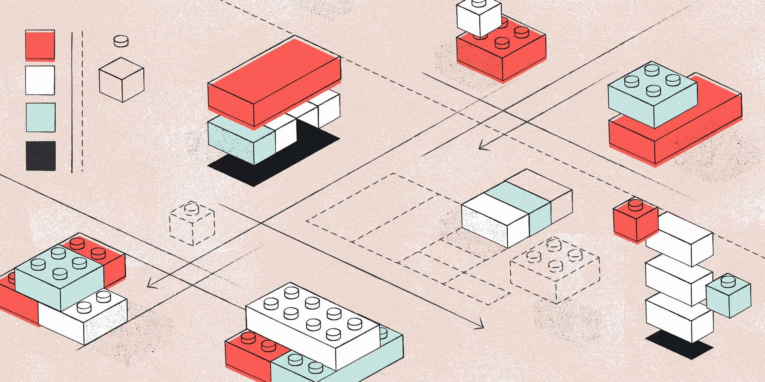
For the foundations, a modular structure was defined based on Atomic Design Principles. e.g. We made sure everyone everyone was building with the same blocks.
RN Atomic Design Principles
Atomic Construction Example
And we created a naming convention to streamline organization across teams.
e.g. We made sure everyone was speaking the same language.
Component Naming Convention Guide
page / section / atomic component / component description
Example Components
Masthead Logo

Global/Masthead/Atom/Logo-00
Mobile Masthead for Members

Global/Masthead/Molecule/Member-M-00
Then we performed an audit of content, pages and components to plan the design of the master style guide

Design
Designing the the hub—the Master Style Guide.
Consistency and simplicity was the name of the game—create a guide to a set of sites that easily addresses the user’s needs.
First, I created wireframes for all of the Foundational Components—the building blocks of the experience.
Foundational Component Wireframe Examples


I then created wireframes for all of the Universal Components.
Universal Component Wireframe Examples


And finally, I took the Foundational Elements + Universal Components and used them to construct the wireframes for Page Templates and Page Specific Components.
Page Specific Wireframe Examples


Develop
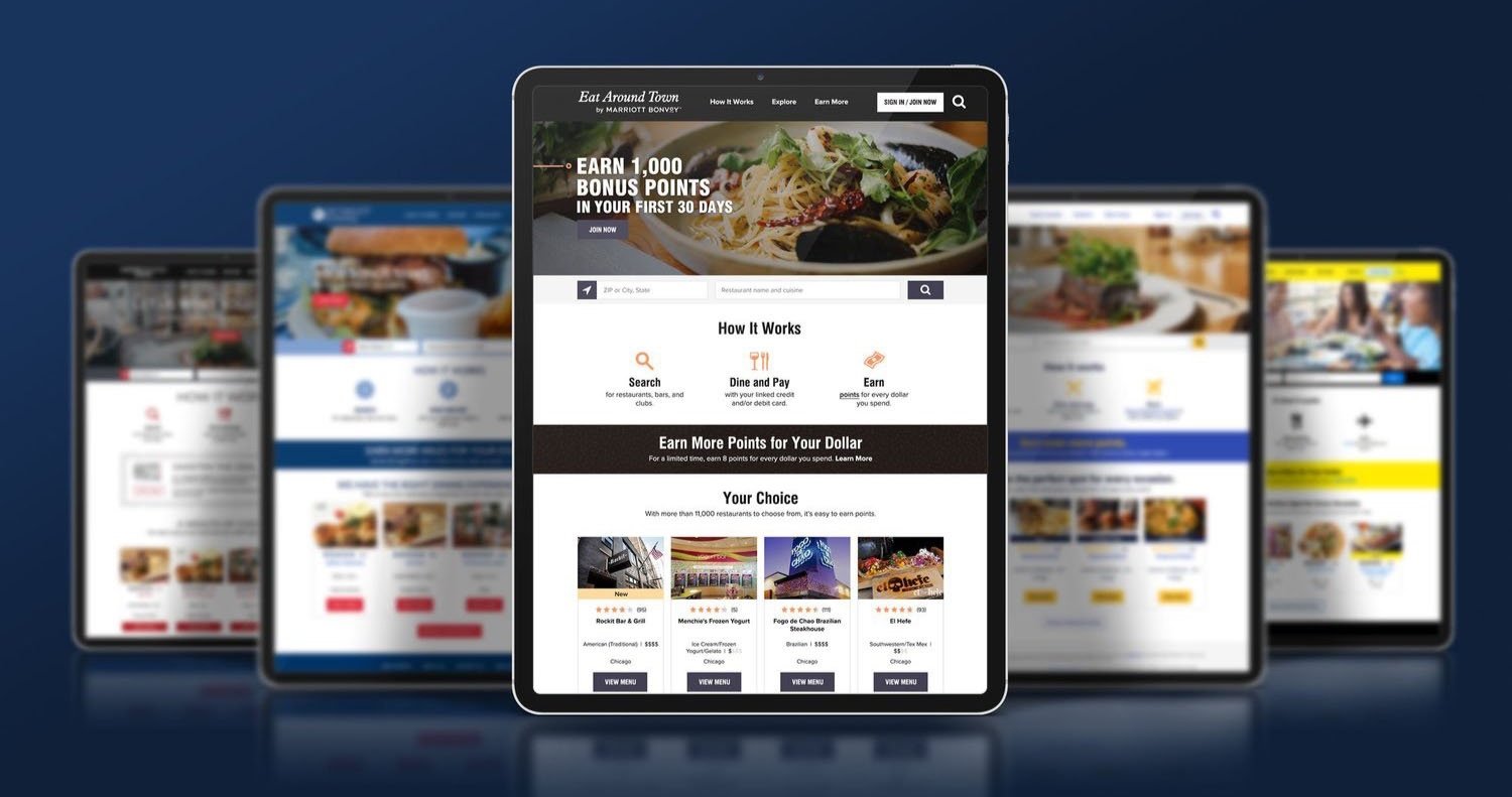
Building out the experiences - the Partner Style Guides
The master style guide allowed us to create a range of consistent, yet individual experiences for the members of our loyalty program partners.
For each partner, I took the Foundational Elements and Universal Components from the master style guide and recreated it, matching the partner’s brand identity.
This automatically generated specifications for development and page mockups for the the client partner’s approval,.
Choice Privileges Connected Style Guide Examples


We recreated this process across each of our partners with guidance and approval from the client partner teams.

Deliver
Designer to Developer
To facilitate the handoff of information, we focused on relationships and strong communication as well as detailed deliverables.
Zeplin functioned as the hub for delivery between design and development.
Connected to Jira and Slack, the templates, annotations and clear organizational strategy made our communication and working relationship better across the team. Which in turn, made the work better.